Mobile-friendly webpages.
"Having a mobile-friendly website is a critical part of your online presence. In many countries, smartphone traffic now exceeds desktop traffic.", you can read in the Help Center pages of Google Search Console. An "unfriendly" display on mobile devices may affect the ranking of a webpage in Google Search and other search engines, but the point is another one: You build your website for your visitors and not for yourself, thus, it's your duty to present them pages, that are properly displayed, easy to read, comfortablely to view and this on all major devices.
I never did any computer science studies and am far away from being an informatics specialist. My technical knowledge, all teached by myself, is enough to develop webpages, both static and dynamic, but there is without any doubt a lack concerning web design, in particular concerning the creation of webpages for mobile devices. This not only means that lots of pages on my site aren't as they should be (unfortunately, my working conditions in the street let not enough time to seriously review the HTML and CSS code), but also, that I'm not competent to write an article about responsive web design. However, this small text may be helpful for web developer beginners, by telling them what is the strict minimum of code, to be included in a webpage, in order to get a somewhat acceptable display on a smartphone. For details and all kind of tips and tricks concerning webpages for mobiles, you should have a look at the Google Search Console Help Center and the web fundamentals articles, refered to on the Google pages. Note, that you also find there a Mobile-friendly Test Tool, that allows you to view your webpages as they are viewed on a smartphone. Another possibility to test mobile-friendliness of your webpages, is to use Chrome DevTools (cf. my article: Generating device dependent webpages with Perl).
Setting the viewport.
The viewport is the user's visible area of a web page. It varies with the device, and will be smaller on a mobile phone than on a computer screen. HTML5 introduced a method to let web designers take control over the viewport, through the <meta> tag.
You should include the following line in the <head> section of all of your webpages:
<meta name="viewport" content="width=device-width, initial-scale=1"/>
The first part of the viewport element sets the width of the page to follow the screen-width of the device, the second one sets the initial zoom level when the page is first
loaded by the browser.
Choosing a font.
To consider for all devices (desktop, tablet, smartphone): Use font-families, that are known to display properly on all systems; use background and text colors, that make reading possible without effort, including for people with sight problems! For mobile devices, the fontsize becomes particularly important; a bad choice wll result in text, that's to small to be comfortablely read. The usage of a relative fontsize unit, as em, is recommended; this does not resolve all possible issues, but is always better than using centimeters or inches, and also as the commonly used pixles.
The simplest way to define all of your font properties, is to set a global font for your document's body in a CSS file. Here an example:
body {
margin: 0;
padding: 0;
background-color: #FFFFFF;
font-family: Verdana, Arial, Helvetica, sans-serif;
font-size: 1.0em;
color: #000000;
}
Proper display of images.
Google Search Console is a nice (and entirely free) online tool for website developers. It not only shows you, which of your pages are indexed (coverage) and how they are ranked in Google Search (performance), but also informs you of erroneous coding, security issues and mobile usability. Common errors stated in the mobile usability report are: "Viewport not set" (easy to correct, as shown above), "Text to small to read" (often corrected by setting a 1.0em fontsize), "Clickable elements to close together" and, rather rare, "Content wider than screen".
After setting the viewport and choosing a proper fontsize, my text-only pages (pages with no images) appeared as "OK" in Google Search Console, However lots of those, that include pictures, were listed with "text to small" (and, sometimes, "clickable elements to close together") issues. It took me a certain time to really understand and to find a simple way to make these pages mobile-friendly, too.
Images and text size.
When creating a webpage for mobiles, you have to be aware that the size of an image will have a direct effect on the text size. In fact, without adding special code, the browser tries to dispaly the full image. If its width fits on the screen, all is ok, the text being large enough to be comfortably read. Based on my Mobile Usability reports of Google Search Console, there are no problems for images with a width up to 700 (or even 750) pixles and in this case, it's not mandatory to add any extra code to your page. But, what happens, if the image is to wide to fit on the screen? In order to avoid that the user has to scroll horizontally, the browser displays the picture, filling up the device's screen width. All page content will be reduced in size by this way and, in particular, the text gets smaller. Easy to understand, that if the picture exceeds a certain size, the text becomes so small, that it has to be considered as "to small to read".
Single images display.
If you have a webpage with single images (i.e. not 2 or more images, placed horizontally one behind the other), the way to make the page mobile-friendly is quite
simple: Tell the browser to limit the image width to the width of the device, thus reducing the image and not the text size. This may
easily be done by CSS. To apply this style to all of your images, add the following to your main CSS file:
img {
width: auto;
max-width: 100%;
height: auto;
}
This tells the browser, that, for all images, their size has to be automatically adapted, the maximum width being set to the width of the device screen and the height
accordingly (keeping the ratio) changed.
This may be enough to resolve all mobile-friendly problems for pages with (single) images. Anyway, I created a special CSS file, that is loaded if the device actually
is a smartphone (cf. below) and, with the code for the image placed into a <div> (with classname "pictures1"), put this style in my pictures_mob.css file:
.pictures1 {
width: 100%;
}
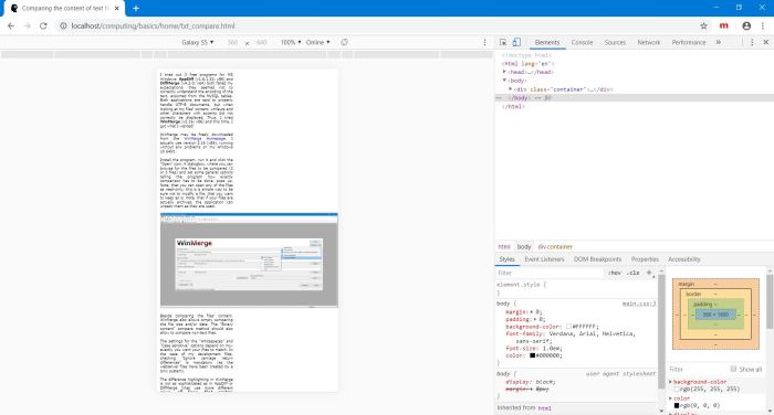
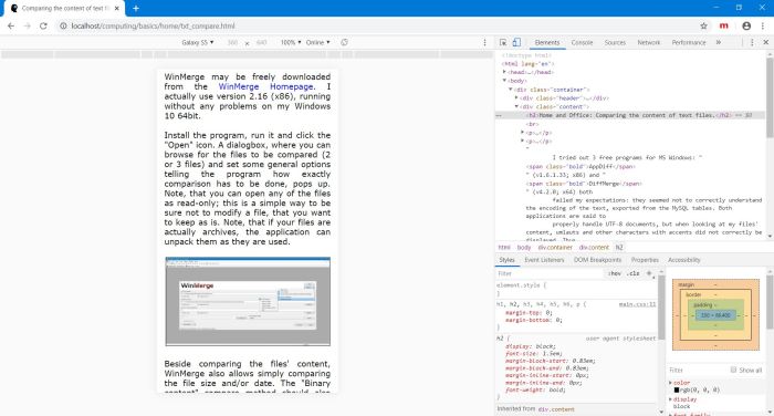
The two screenshots show, how a single image page would be displayed on a Galaxy S5 (by simulating it, using Chrome DevTools); on the left: the default display with text size reduction, on the right, the proper display with image size adaption, after the CSS, described above, has been added.

|

|
Multiple images display.
If you have a webpage with multiple images (i.e. 2 or more images, placed horizontally one behind the other), it isn't really mandatory to make any further efforts; the image size reduction, as described above, could be used to place the images side by side, the total width being reduced to the width of the smartphone screen width and thus getting a text, large enough to be comfortably read. However, this way to proceed may result in rather small images, especially if there are three of them "in a row". A better way to do in this case would be: Tell the browser to arrange the images horizontally if the connecting device is a desktop machine, vertically if it is a mobile.
The easiest way to implement this, is to use 2 CSS files, one for desktop, the other for mobile devices, each of them containing the appropriate style definitions for the images disposition. Two things to do:
- Finding a way to load the correct CSS file, depending on the connecting device (cf. below).
- Creating the code for the horizontal resp. vertical disposition of the images.
If you divide your webpage into several panes, using the <div> tag (a classic example is a header and below a navigation pane at the left
and a content pane at the right), you may use the "float" property to arrange the panes. Here the possible values:
| float: none | No floating, i.e. the pane is placed below the previous one. | ||
| float: left | Floating to the left, i.e. the pane is placed as much as possible at the left. | ||
| float: right | Floating to the right, i.e. the pane is placed as much as possible at the right. |
This means: If the two <div> with the 2 images have both the properties "float: none", they will be placed one below the other (as we want for the mobile page); if the <div> with the first picture has the property "float: left" and the second one the property "float: right", the two pictures will be placed side by side, the first one at the left (as we want for the desktop page).
Code in my pictures.css file (file to be loaded for desktop devices):
.pictures2 {
width: 100%;
}
.pictures21 {
float: left;
width: 50%;
}
.pictures22 {
float: right;
width: 50%;
}
Again, I'm not sure, if the "pictures2" <div> (containing "pictures21" with the code for the first image and "pictures22" with the code for the second image) is really necessary. Also note, that the widths of the two panes, defined by this code, have been chosen equal size here (by setting both "width" values to 50%).
And the code in my pictures_mob.css file (file to be loaded for mobile devices):
.pictures2 {
width: 100%;
}
.pictures21 {
float: none;
width: 100%;
}
.pictures22 {
float: none;
width: 100%;
}
Essentially the same for 3 images, with 3 <div> to define in this case. However, the understanding of how the "float" property works,
is needed to correctly code the styles in the 3-image desktop file. Here's how it should look like:
.pictures3 {
width: 100%;
}
.pictures31 {
float: left;
width: 33%;
}
.pictures32 {
float: left;
width: 34%;
}
.pictures33 {
float: right;
width: 33%;
}
The point to consider concerns the value of the "float" property of the middle image. It has to be "left" and not, as you may perhaps be expecting "right". Here the explanation: The first picture is placed at the left, then the middle one as far to the left as possible. This means: with the first picture already being at the left, the left-most position to place the second picture will be at the end of (behind) the first one. Thus, this second "left" value places the middle picture to the right of the first one (and the third one being placed all to the right, i.e. behind the middle one). Using "right" as float value for the second picture, would also have placed it behind the first one, but the third one would then have been placed in front (the left) of it, because the right-most position would have already been occupied. And the pictures wouldn't have been in the order, we wanted!
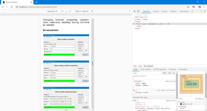
The screenshots show a page with 3 images; on the left: arranged horizontally on a desktop screen (in Chrome browser), on the right: vertically arranged on a mobile screen (simulated by Google DevTools).

|

|
Device-dependent webpages.
Depending on your page content, it may be best to create different pages for desktop and mobile users and then redirecting the visitor to one of them, depending on the device, she connects with. Or, alternately, usage of the same page, but defining 2 or more possible layouts (as I did for my images). Some common multi-device techniques:
- Page redirection, using a "Redirect" command in the Apache httpd.conf file.
- Page redirection, using a Javascript function.
- Usage of different CSS files, depending on the device's viewport.
- Generation of pages with different layout (case of dynamic pages, created by a script).
Media queries are simple filters that can be applied to CSS styles. They make it easy to change styles based on the characteristics of the
device rendering the content, including the display type, width, height, orientation, and even resolution. The media queries are included with the stylesheet descriptions
in the document's <head> section. Example:
<link rel="stylesheet" media="(max-width: 640px)" href="mobile.css">
<link rel="stylesheet" media="(min-width: 640px)" href="desktop.css">
When the browser window is less than 640px wide, the styles, defined in mobile.css will be applied, otherwise, the one defined in desktop.css will be used.
For details, on how to generate different pages, depending on the connecting device, with Perl, please have a look at my article Generating device dependent webpages with Perl.
If you find this text helpful, please, support me and this website by signing my guestbook.