Device dependent webpages with Perl.
This tutorial applies to dynamic webpages, generated by Perl scripts, in opposition to static pages, where the page content and the page layout don't change and that are stored as .html files on the webserver, that returns them directly and "as are" to the browser. As dynamic pages do not physically exist, but are created by the script, each time a webbrowser asks for them, it seems reasonable to create pages with different layouts, one for desktop and another for mobile devices, in order to produce a friendly and nice view of the page in both cases.
Reading this tutorial presupposes that you're familiar with HTML and Perl CGI. The explanations, given here, are limited to a (short) description, how you can tell Perl to detect the device type and, accordingly, generate the one or the other page. Note, that we are speaking here of 2 different page layouts, the page content being the same (this should always be the case!) The tutorial also includes some hints on how to test your pages, using Chrome DevTools.
The example used in the tutorial concerns the species details pages of my AnimalDBB application. Using the "primary" layout, looking good on a computer screen, wouldn't produce a display, that the mobile user could call friendly: In fact, on the small screen of a mobile device, the two panes (the animal description with the photo and the systematics table) are lots to large to be properly displayed, when arranged horizontally placed one behind the other.
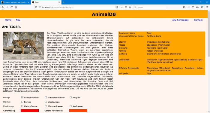 |
I decided to use a "secondary" layout for mobiles, just placing the systematics table above the animal description. And, to make Perl generate the page, using the first or the second layout, depending upon the user's device is a computer or a smartphone.
Using templates to generate webpages.
Instead of including the page HTML within your Perl code, you can create a HTML template, containing the page layout and the static data, and using some "custom tags", that the script will look for, when parsing the template, and replacing them with the actual data (in our case the details for the actual animal, as found in the MySQL database). Task to create the device-dependent animal details pages:
- Writing 2 templates, one with the desktop, the other with the mobile layout.
- Get Perl find out, if the connection is done by a computer or a smartphone.
- Depending on the device type, read the one or the other template (and insert the actual data).
We should not bother about the HTML of these templates. Just the following: The different "parts" of the page, shown on the screenshot above, are tables, placed in a given way (differently for the 2 page layouts) within the rows and columns of a main table.
HTTP connections and user agents.
When a client (mostly a web browser, but may also be a crawler) connects to a webserver, it passes a certain number of parameters, such as the IP address and
the URL, where it comes from. Another parameter is the so called user agent, which is an identifier of the client itself, with information about the operating
system and the browser. Some examples:
Firefox on Windows 10 desktop: Mozilla/5.0 (Windows NT 10.0; Win64; x64; rv:61.0) Gecko/20100101 Firefox/61.0
Safari on Mac OS X iPhone: Mozilla/5.0 (iPhone; CPU iPhone OS 11_4 like Mac OS X) AppleWebKit/605.1.15 (KHTML, like Gecko) Version/11.0 Mobile/15E148 Safari/604.1
Google desktop crawler: Mozilla/5.0 (compatible; Googlebot/2.1; +http://www.google.com/bot.html
The parameters passed by the browser are directly accessible by scripts. With Perl, this is done through environment variables. To read the user agent from a Perl script, use: $ENV{'HTTP_USER_AGENT'}.
A possible approach to detect a mobile would thus be to read the user agent environment variable, parse it and then decide, based on given criteria (e.g. does the string contain "mobile"?), what the device type is. However, why to write your own function, if some nice and easy to use module exists?
Using the HTTP::BrowserDetect module.
The HTTP::BrowserDetect object does a number of tests on HTTP user agent strings. The results of these tests are available via methods of the object. For a full description (and download link), please visit MetaCEPAN.
For our purpose, the following 3 methods are needed:
Creation of the object: my $ua = HTTP::BrowserDetect->new();
Test if the connecting device is a mobile: if ($ua->mobile) ...
Test if the connecting device is a given crawler: if ($ua->robot() eq 'crawler-id') ... (crawler-id defined within the module)
Device-dependent page layout code.
Let's call the desktop template "species_details.template.html", and the mobile template "species_details2.template.html". The only thing to do within the script, that displays the animal details, is to read the second template if the connection comes from a smartphone, otherwise the first one. This should produce a friendly view on smartphones, but will not deliver the mobile version of the page to the mobile version of Googlebot. Thus, the validation of the page will fail in Google Search Console. Unless, you extend your code by adding a test on the return of the "robot" method (note, that the crawler-id for the mobile version of Googlebot is "googlemobile").
Here the code to read the correct template (as runs on my Windows 10 local Apache):
my $ua = HTTP::BrowserDetect->new(); my $template;
if ($ua->robot()) {
if ($ua->robot() eq 'googlemobile') {
$template = "$animaldb_dir\\species_details2.template.html";
}
}
elsif ($ua->mobile) {
$template = "$animaldb_dir\\species_details2.template.html";
}
else {
$template = "$animaldb_dir\\species_details.template.html";
}
open(my $input, "<", $template)
or die "Can't open template file $template: $!";
my @lines = <$input>;
close($input);
Using Chrome DevTools to test mobile viewports.
Google Chrome comes with built-in mobile testing tools. There are similar functionalities in Firefox and Safari. Note, however, that with Firefox, for example, the user agent string is not automatically changed (except, if you install an appropriate extension). To access the mobile developer tools, right click on the webpage and select Inspect (or Inspect Element) from the drop-down menu.
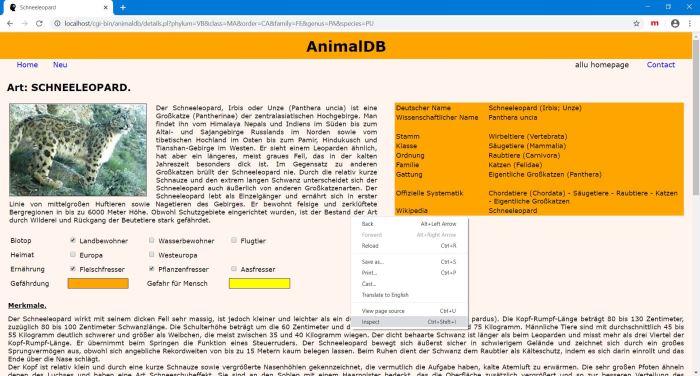 |
The window splits in 2 parts: at the left, the webpage display, at the right the HTML code with lots of information and the possibility to inspect any given element.
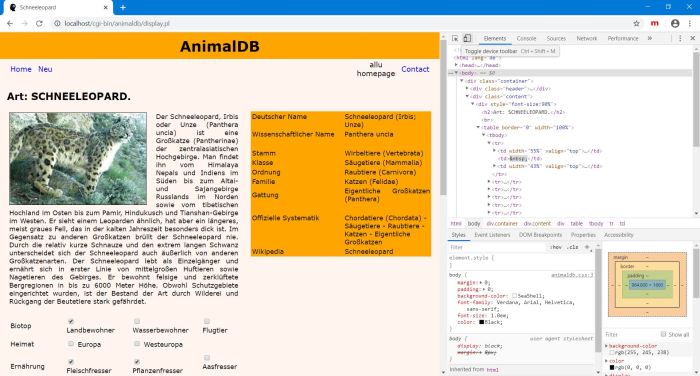 |
On the toolbar in the right pane, click the Toggle device icon. The webpage in the left pane is now shown as displayed on a mobile device. Among those in the list, choose the smartphone, that you want to use for your test.
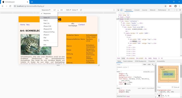 |
You now view your page as it would be displayed on the screen of the smartphone, that you have selected for your test. In our example, it seems evident that the text would appear lots to small for comfortable reading! (The display also shows, that the global layout of my page is not as it should be, the header and top menu not extending over the complete screen width, as it does on a computer screen - responsive webdesign knowledge lack of myself; not in relationship with the content of this tutorial).
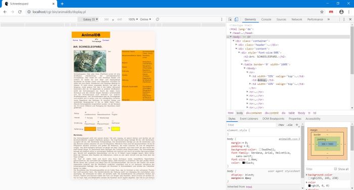 |
The "text to small" page displayed in the virtual Galaxy S5 is the one generated using the desktop layout. Why this? Simply because the page was loaded by my Windows 10 Chrome browser and it's the return of the webserver to that request, that is actually displayed. To see, if the Perl script does, what we expect it to do, and reads the mobile template, if the connecting device is a Galaxy S5, we have to do a page refresh (right-turning arrow icon in the Chrome top bar).
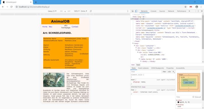 |
Note, that I made this screenshot after, beside moving the systematics table above the animal description, I also reduced the picture size in the mobile template code.
Page not perfect, I know. But lots better and what's important, lots easier to read, as with the desktop page layout. And that's what's important here...
Using Google Mobile-friendly Test Tool.
Google Search Console provides an online mobile-friendly test tool: Just go to the site and enter the URL of the webpage to be tested. That's what I did from my Firefox browser with the online version of the local animal details page used in the rest of this tutorial.
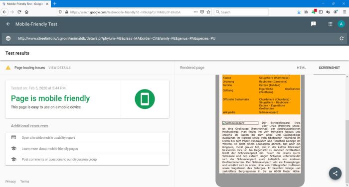 |
If, on the screenshot, there appears a "page loading issues" message and the animal picture isn't displayed, that's simply because the folders, containing the photos are blocked for crawlers in my robot.txt file (because I think, that it wouldn't be correct of myself, to have pictures, that are property of other people, indexed and being listed in search engines with my domain name and website adress).
If you find this text helpful, please, support me and this website by signing my guestbook.